creatE a FANTASTIC POWERPOINT PRESENTATION
|
... and avoid death by PowerPoint
|
Source: PresenterMedia
|
PowerPoint is a fantastic tool that you can use to enhance any oral presentation.
Unfortunately some presentations can leave you bored and even confused. Use the following hints and tips to create a memorable and successful presentation. |
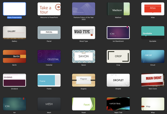
Use different templates to make your presentation stand out
|
Did you know that there are other sources for PowerPoint slides besides what is available in PowerPoint?
Have a look at the free sites below to see if there is something that will make your presentation different to everyone else's. |
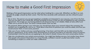
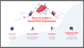
Follow the 5/5/5 rule
Your slides are meant to support what you're saying not simpy repeat your entire speech. Experts suggest you have no more than:
- 5 words per line of text
- 5 lines of text per slide, or
- 5 text heavy slides in a row
See how by just be adding a few graphics and removing the extra text, a slide can be more interesting.
|
|
Source: 24Slides
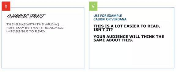
Choose readable fonts and colours
|
Your text should always be easy to read so select a font and size that can be read even from the back of the room. Most experts agree that fonts should not be smaller than 24 points and that sans serif fonts for the main text is best.
Examples of san serif fonts include:
|
See how plain fonts are easier to read.
Source: ispring
See how font colour can made a huge difference to readability.

Source: GCFGlobal
|
Be careful with animation
|
PowerPoint has the ability to add animations to your slides and slide transitions. As a general rule, too many animations make your slides look unprofessional and distract your audience.
If you use a transition animation, make sure you use the same style for the whole presentation. Also make sure that any animated images you use are related to your topic. |
While these dancing bears are cute they may not be the best choice for a presentation on climate change.

Source: epickalmaricat
|
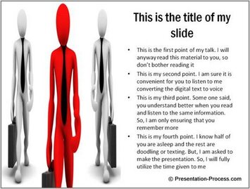
Use images thoughtfully
Images are an important part of any presentation. With your images, make sure that they are:
|


Source: Slide Team
Source: PresentationProcess

Source: Freepik
|
References
- Albinagorta, C. (2019). Bad PowerPoint examples you should avoid at all cost. https://24slides.com/presentbetter/bad-powerpoint-examples-you-should-avoid
- GCFGlobal. (n.d.). Simple rules for better PowerPoint presentations. https://edu.gcfglobal.org/en/powerpoint-tips/simple-rules-for-better-powerpoint-presentations/1/
- Mulhotra, A. (2016). 11 dos and don'ts of using images in presentations. https://www.slideteam.net/blog/using-images-in-presentations-11-dos-and-donts
